
IMPIRA THE AI-POWERED DAM REBRAND
IMPIRA THE AI-POWERED DAM REBRAND
Generative identity
for AI platform
Impira is an AI-powered data asset management platform that can organize, analyze, search and create digital assets using advanced machine learning and computer vision technology that was previously only accessible to highly technical users. Team of designers including myself at DesignStudio helped Impira create their brand identity and strategy and make known in the already crowded tech industry.

Working collaboratively with Impira’s founder and team we immersed ourselves in their world through a series of interactive workshops, research, and product use, along with candid interviews of key customers, team members and partners.
Thinking beyond traditional category codes, themes emerged around bringing clarity to chaos, enabling radical efficiency, bridging gaps to form new connections, and above all, unlocking creativity to making work more meaningful.

Make Meaningful
Impira’s new brand proposition, ‘Make Meaningful’, shares their role in enabling creative teams and individuals to work more efficiently. The identity is built around a distinct library of organic shapes that will grow with the company. Each shape structure was created by a generative system using dynamic particles in motion that can construct unlimited new forms each time it’s used.
The shapes interact with a rigid grid system, that when combined, represent the interplay between structure and creativity found in thriving creative environments. Impira’s primary palette of black, white and grey is layered with a secondary palette of eight colours that appear in varying quantities depending on the tone of the application.
Interplay between
the structure and
the unstructured.


Digital Brand Portal
The shapes interact with a rigid grid system, that when combined, represent the interplay between structure and creativity found in thriving creative environments. Impira’s primary palette of black, white and grey is layered with a secondary palette of eight colours that appear in varying quantities depending on the tone of the application.
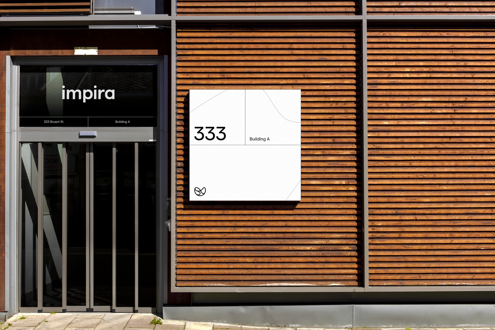
As the organization continues to scale, we showed how the brand can be leveraged to infuse small yet meaningful details consistently. We envisioned how the new brand can be infused within potential new spaces, from environmental details to wayfinding.


Design Principal: James Hurst
Brand Strategy Director: Sophie Kaady
Senior Designer: Sam Song
Designer: Duy Dao
Motion Designer: Roberto Warner